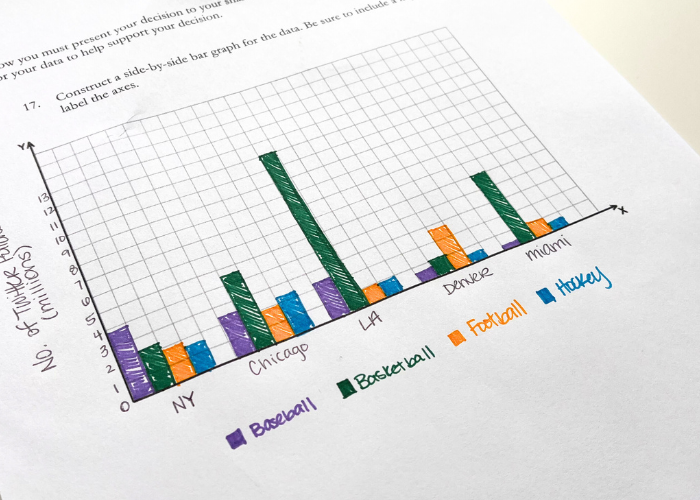
When I was in my second year teaching I had a student teacher for one class of the day. We needed a project to help our students understand and practice making two-way frequency tables of categorical (qualitative) data. He had an idea that included students gathering data and (the best part) using it to make an informed decision! I LOVED the idea and we worked together to create this lesson. I’m sharing it here in the hopes that you love it to!
Lesson Hook
I start the lesson by “hooking” the students. I ask them to imagine that they are developing a new sports drink and need to use a modest advertising budget in the most effective way possible. Since they’re selling a sports drink they’re going to advertise to sports fans and must determine which sports audience will be the best choice to advertise to. They’re operating a start-up, so they don’t have the means to advertise everywhere like Gatorade would – they must choose one team from one city to advertise with. Then I throw the conversation over to them. How would you find the largest sports fan audience to advertise to?
Students can discuss with partners or in groups, or you can lead a whole class discussion. The conclusion is that they can find the biggest fan base by looking up how many followers a team has on social media.
Categorical Data Project
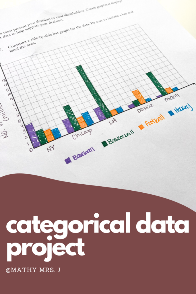
Next, students collect the data needed for the project. Students must decide which cities and which sports to analyze, and how to organize the data. (Hint, hint two-way frequency tables!) They can either look up the number of followers for each team or you can provide a handout with the data to save time. This handout is provided if you buy my resource from TpT. By the way, there are 6 cities in the US with a football, basketball, baseball, and hockey team: New York, Chicago, Los Angeles, Denver, Miami, and Dallas. Technically some of the teams are in a nearby city or are representative of the whole state.
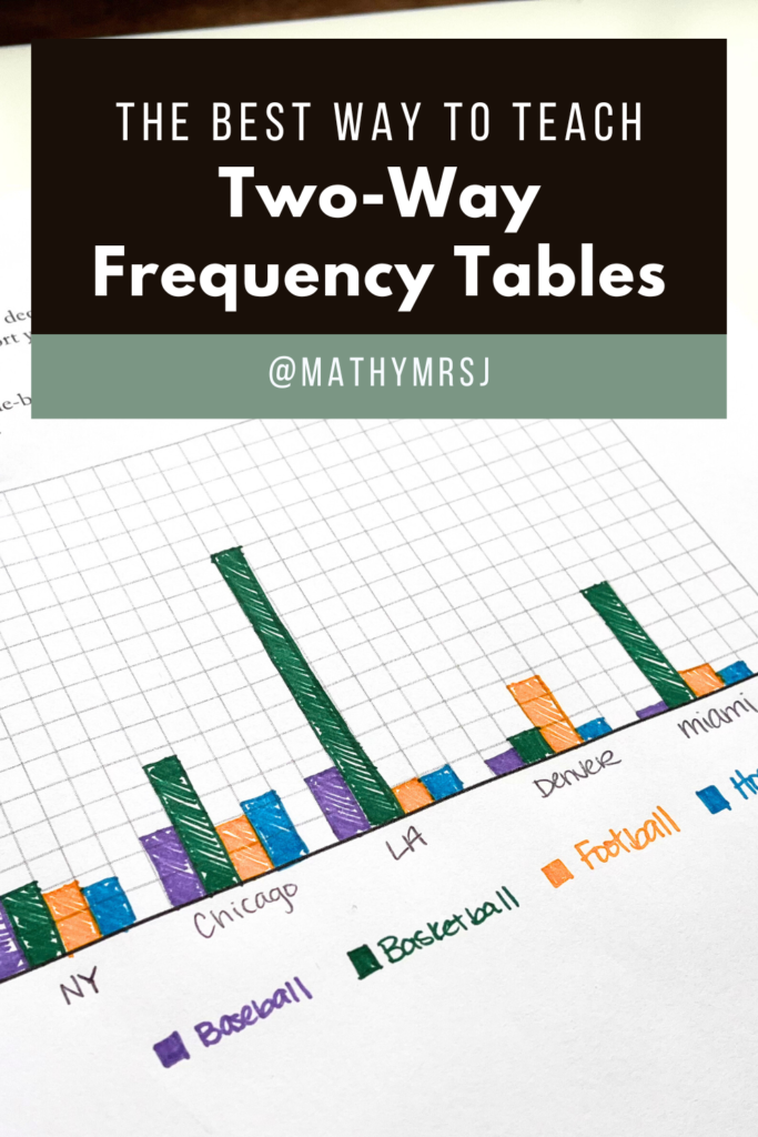
Once the students have organized the data in a table they can create visual organizers, either a stacked bar graph or a side by side bar graph. The students can choose to either make the x-axis the city names and the legend differentiate by sport, or the x-axis can be sport type and the legend differentiates by city. Perhaps the most difficult part of the project is determining the correct y-axis scale. This is beacause many of the sports teams will have thousands or millions of followers.
Differentiating and Extending the Project
I love to offer extensions in my lessons (just check out my Area of a Sector project!) As I mentioned above, you can save time by providing students with screenshots of the data so that they don’t have to spend time looking it up. Additionally, you can provide graphs with the axes already labeled for students who struggle with choosing a scale or setting up the key/legend. This allows you to only assess students’ ability to create the bars of the graph.
You can differentiate the project by asking open ended questions, such as
- If you can only advertise to baseball teams, which team is the best to advertise with?
- If you can only advertise on the west coast, which team is the best to advertise with?
- Which team do you think is gaining most in popularity? Is it best to choose that team? Why or why not?
- Which team do you think is losing popularity? Should you avoid advertising with that team? Why or why not?
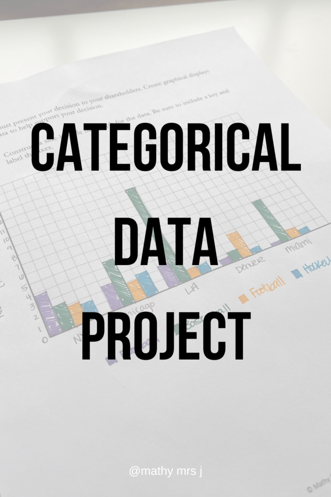
Try this categorical data project in your classroom and have students pitch their sports drinks ideas shark-tank style! Reach out on IG if you try this out – I’d love to hear how it goes!
Happy teaching,
Natasha

